Every year on my birthday I gift myself with some cosmetic product which I can’t afford to buy on any other usual day of my life. So this year I opted for the Too Faced Natural Love Ultimate Neutral Eyeshadow Palette.
I know the Too Faced brand. Moreover, I have an eyeshadow palette by this brand which I bought in 2008 and it’s just fab! So this is actually why I opted for this palette after some hesitation between the Tarte, Lime Crime and Too Faced palettes. 
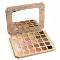
This Too Faced palette is comprised of 30 colors of natural shades. Here you can find pink, golden, even some copper shades as well as a lot of neutral colors. In general, having a look at this palette I always have an impression that it’s an ideal everyday makeup palette.
It looks rather simple and neutral but there’s some sophistication to it like duochrome shades. There are also mattes, satin and truly shimmer shades.
Taking the ball before the bound I want to say that this palette is a complete waste of $59 as the quality of the products leaves much to be desired. Of course if I prep my eyelids with a primer beforehand, the outcome won’t be so frustrating but still I remember that quality the Too Faced products used to offer and my eyes become literally watery. It’s difficult not to scold myself for this purchase. I wish I bought a Lime Crime eyeshadow palette. And a small Tart palette bundled with it.
Honestly, I think the color selection is bad here. It seems that there are a lot of shades you can use but believe me, you’ll find use of only 10 shades maximum. The others are very similar and if mixed together, they look absolutely the same on the eyes. I guess the same recently happened with the Ultimate Palette by the Urban Decay brand. The price is higher but it’s two times more in shades. And as a result all the shades are so much the same that it’s difficult to make out at least 5-6 usable colors. And the same story is with this Too Faced palette. They could have easily cut down the color selection 2-3 times less and we wouldn’t have even noticed it.
PACKAGING
The palette itself is made of thick cardboard material and I hope it’ll look just as nice as my old palette by Too Faced in the future. The surface is matte and the print stands out. There’s a beautiful golden decor to it.
The name also stands out and it seems to be made of some material that really resembles chamois cloth. This cloth is very easy to scratch by the way. And here you can see the result of a month of constant use. There are already some scratches on the palette.
The palette is somewhat flat, at least if compared with some other palettes by the brand. It isn’t travel-friendly as it’s big and bulky.
There was a leaflet with the product description, color mixing and the Too Faced Natural Eyes Timeline.
All the names of the shades are properly printed so you can be sure that they won’t fade over time.
The ingredients of every shade are given separately here:
So, I guess it’s time to pass over to the shades description and looks:
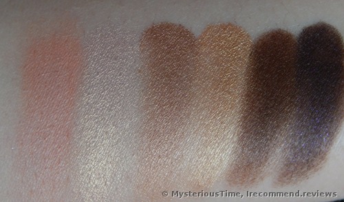
For the better understanding I’ll describe and show each shade alone:
Heaven - whitened beige neutral color. It’s nicely pigmented and has small grains. It covers all the veins on my eyes beautifully. I wear it alone for my daytime makeup and then darken the outer crease a little. It’s dusty hence the spending is big.
My rate: 4/5 stars
Fairy Tale - it isn’t even an eyeshadow for me, you know. It a hybrid of glitter and foiled faint golden color. It doesn’t give much color, just a hint of it and of course it shows a lot of shine. It doesn’t want to sit on the eyes alone and requires some tacky primer or creamy eyeshadows. It sits on the brush well, though doesn't apply on the eyes. So it’s better to pat it with a finger. Since I have sensitive eyes and this very color got stuck in my eyes several time, I just stopped using it.
My rate: 3/2 stars
Nudie - one of my faves! It’s a matte tinged cocoa shade with warm undertones. It has custom pigmentation and it’s better to layer as it’s such a nice transition shade. By the way, if you want, you can always blend it out to create a seamless finish. It’s dusty, though less dusty than Heaven.
My rate: 4 stars
Tickle Me - shimmer warm toned average brown hue. This one is so sparkling that it shows the lids’ texture which makes it useless for aging makeup. Anyways, I don’t have wrinkles by my eyes but this color showed the texture so much that I was even afraid to see so many creases and crevices. The main disadvantage of this color is it’s chunky texture. Even on the swatch you can see that it applies with some clumps. Even if I touch it with the lightest hand, I still can see a dent in the pan, let alone the too much product sitting on the brush and dusting as though there’s no tomorrow.
My rate: 3 stars
Don’t Settle - dark brown shiny shade with bronzy undertone. It looks like dark chocolate. It’s also chunky but not as much as the previous shade. The pigmentation is good.
My rate: 4 stars
Fingers Crossed - it’s a beautiful deep brown hue of a bitter chocolate shade. It has a satin finish and I have nothing bad to say about it.
My rate: 5 srars
Lace Teddy - whitened pinky-peach matte shade. It’s packed with color so it easily covers my skin. Nice mill but it can be a little dusty during application. Oddly enough but I noticed that this very color can oxidize over different primers and change its color to the darker.
My rate: 4 stars
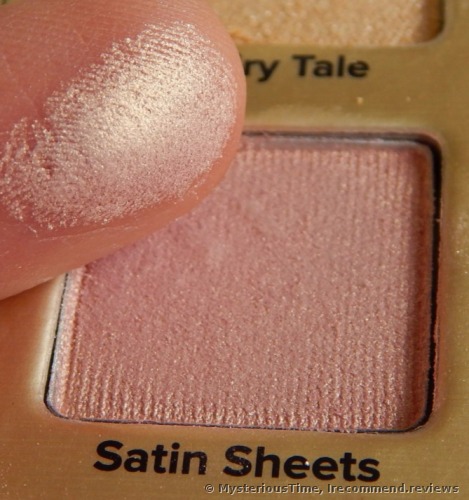
Satin Sheets - faint pink chameleon shade that changes to golden.Very beautiful shade.
My rate: 5
Push-up - faint-brown-copper shade. Nothing bad about it in terms of quality but it’s so hackneyed that I can find it in many other eyeshadow palettes which are way cheaper.
My rate: 5 stars
Honey Pot - it’s also copper-golden but lighter shade
Push-up is somewhat darker but still it isn’t much different. After all on the eyes they look almost the same.
My rate: 5 stars
Chocolate Martini - deep dark brown with golden sparkle. It’s satin in finish, well, semi-satin or even sometimes matte in finish.
My rate: 5 stars
Undercover - creamy brown cool-toned shade with a beautiful blue shimmer to it which unfortunately falls out a lot and isn’t visible on the eyes.  And the rest that still managed to stay will eventually fall out while wear. One of the most disappointing colors here!
My rate: 3
Pink Cheeks - tinged pink shade that is badly pigmented and comparing with the other shades this one is much worse in quality and coverage. The only use of it is under the brow bone as it’ll never hide the small veins on my lids.
My rate: 3 stars
Kittens - pink-lilac chameleon shade that changes to golden. It’s beautiful in the palette though on the eyes I can’t make out any difference between this shade and Satin Sheets.
My rate: 5
Bunny Nose - it’s a dangerous satin pink hue. I can apply it only beneath an eyeliner, otherwise it makes my eyes look cried out. But this isn’t the biggest problems, guys. The color is so patchy! Over a primer or without it I still can’t apply it evenly. And I can’t say that I’m not experienced enough. No, my skills in terms of eyeshadow application are fine, so it’s only the color to blame here.
My rate: 2 stars
Moonbeam - it’s an interesting beigy-silver shade. It’s chunky but bearable.
My rate: 4 stars
Love Bug - purple lilac shimmer shade. It’s very alike with the Sleek eyeshadows texture-wise.
My rate: 5 stars
Smokin’ - very crumbly shimmer olive and gray hue. And again, the dusting is huge and the dent is here even if I use the softest brushes.
My rate: 3 stars
Poodle - this one is a very fair satin pink color. It’s nice for highlighting the brow bone and in general, nothing to blame it for.
My rate: 5 stars
Cutie Patootie this is the same story as with the Honey Pot and Push-up. They are similar in quality and shade on the eyes.
My rate: 5 stars
Dear Diary - bronze-gold hue that is almost the same as the mentioned above three colors. I have nothing to add here, though maybe the fact that this shade is a little bit darker.
My rate: 5 stars
Coffee Date - bronzy-golden shade which is more reddish than its analogues.
My rate: 5 stars
Spoiled - dark brown semi-satin hue
My rate: 5 stars
Night Fever - dark olive-brown shade that is reminiscent with Smokin’ but a little bit warmer and not so crumbly.
My rate: 5 stars
Spotlight - baked milk color that works nice for blending and as a transition shade. The pigmentation is from weak to average though it’s very easy to pack.
My rate: 4 stars
Honey Butter - it’s such a dusty peachy shade with a light orange hint that works fine for blending.
My rate: 4 stars
Honeymoon - pinky-coral shimmer shade. It severely drops the powder and applies patchy.
My rate: 3 stars
Hot & Bothered - red shiny copper
My rate: 5 stars
Makeup & Chill - neutral brown-creamy beige shade. It’s matte and well packed with pigment. This is one of my faves from the palette.
My rate: 5 stars
Stiletto - black, simple black shade. By the way it has become less black than before. Now I can see some gray notes to it. Even though it’s still one of the best pigmented black hues for me.
My rate: 5 stars
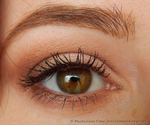
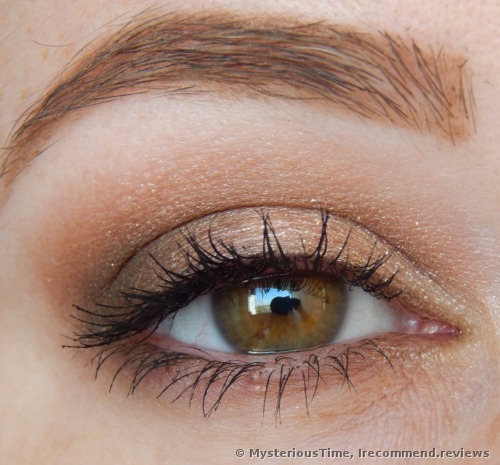
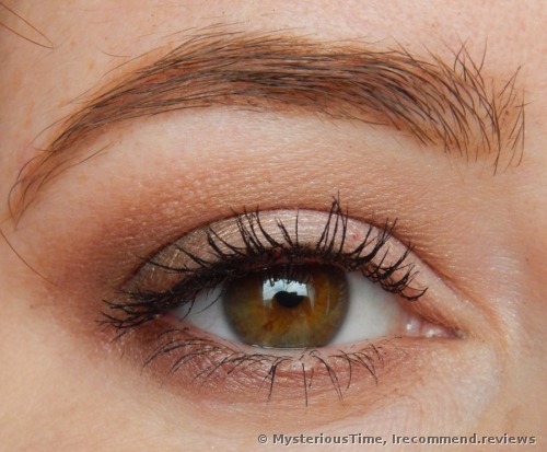
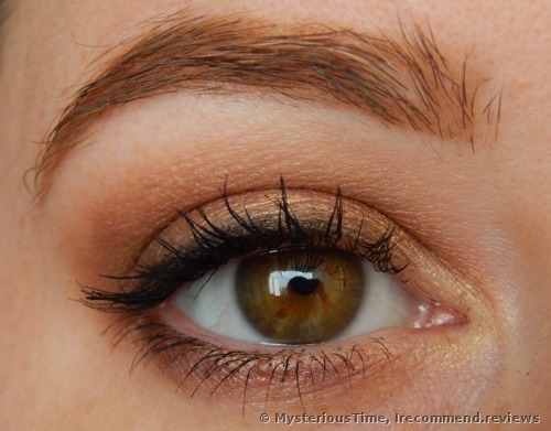
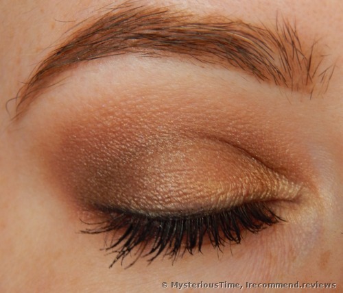
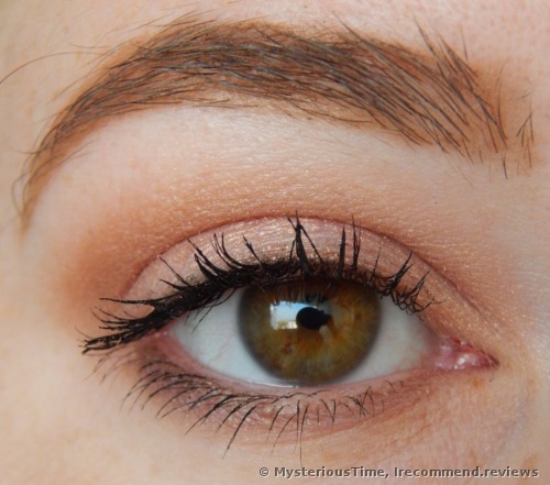
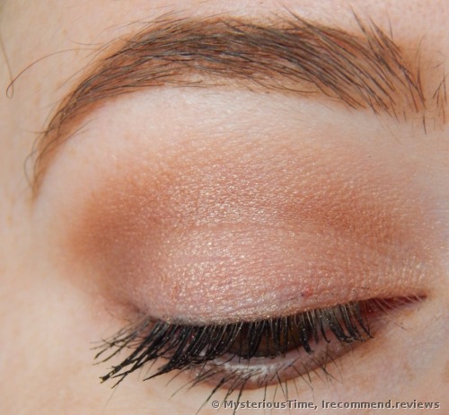
And here’s a couple of makeup looks done with the products.
Honestly I can’t say where I applied each shade, as, first of all, I don’t even remember them and secondly, some shades are so alike that I can’t tell one from the other. But here are 5 different makeup looks that I did intentionally during the working week and then took pictures of them.
I do really hope that you didn’t get bored reading my reviews. Frankly speaking, I do believe that the Too Faced brand is fine when they release their small 12-shades eyeshadow palettes. There’s no need for them to catch up with the tendencies and make huge palettes like this one. There’s almost no use for it. I don’t even remember the last time I encountered such a bad-quality eyeshadow palette. And considering the price…
Well, I can’t recommend the Too Faced Natural Love Ultimate Neutral Eyeshadow Palette to you. Believe me, the Sleek palettes are much better.
Price: $59.00



 And the rest that still managed to stay will eventually fall out while wear. One of the most disappointing colors here!