Hey!
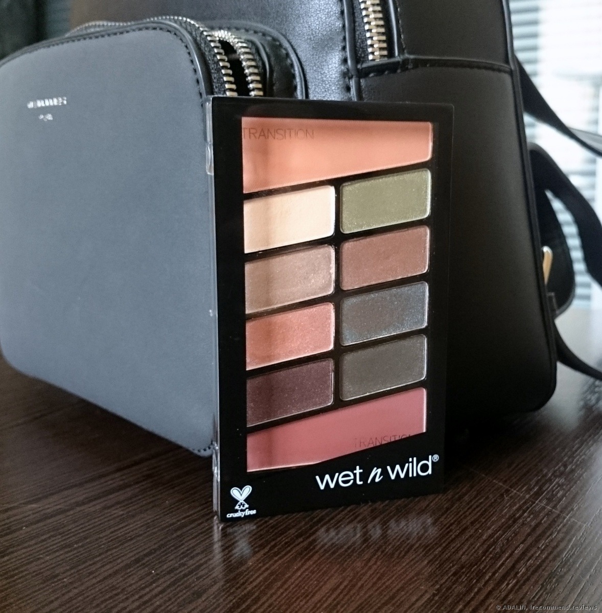
Wet n Wild Color Icon Comfort Zone Eyeshadow palette
I saw this palette in a local beauty store and bought it just because the shades seemed to be rather wearable for me. I didn’t expect much from it, however, I was soon very pleasantly surprised. I’ve already had two eyeshadow palettes in my collection, which were absolutely fantastic in all respects, but still, I wanted to give a try to an eyeshadow palette from this brand.
So,
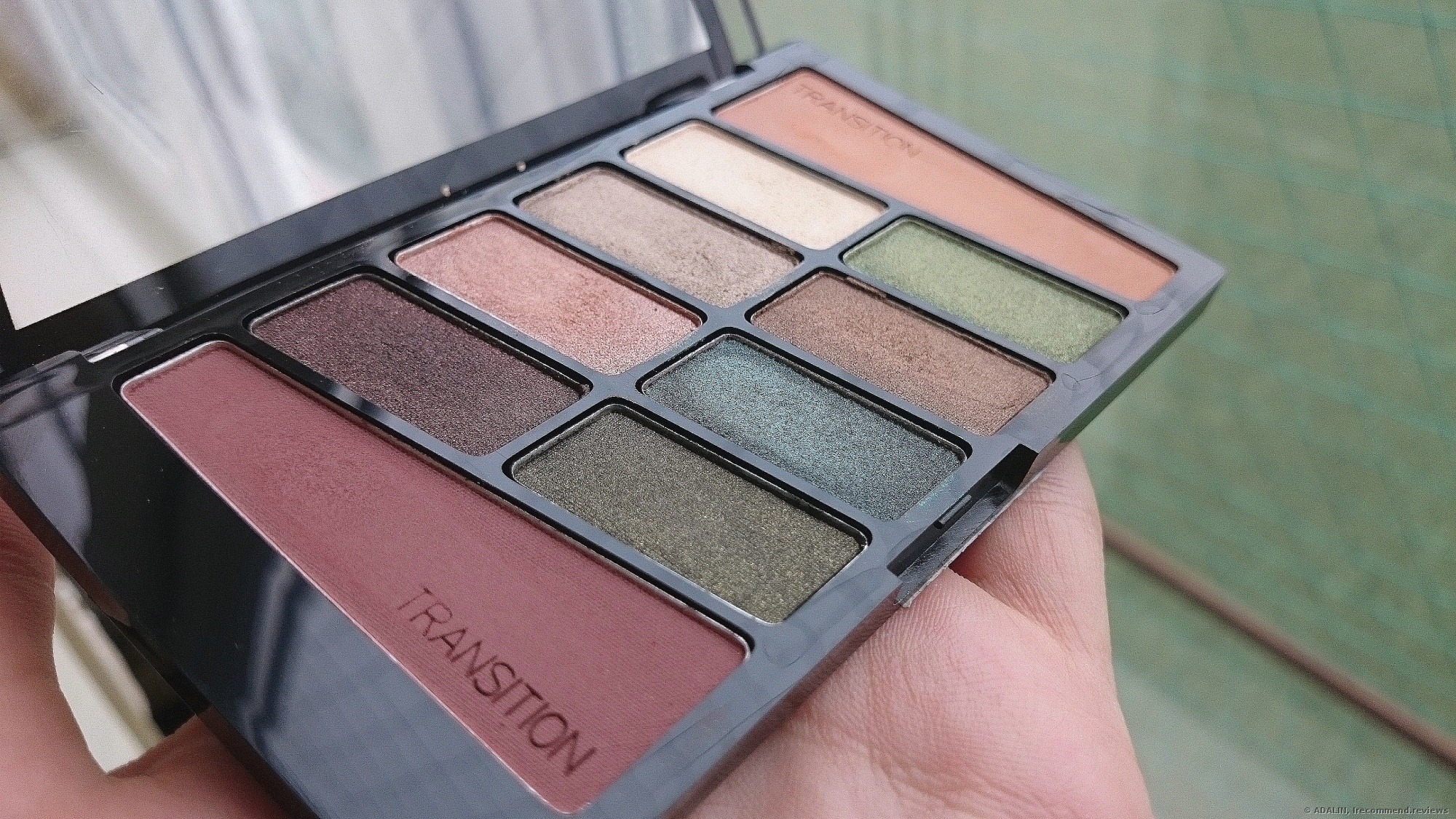
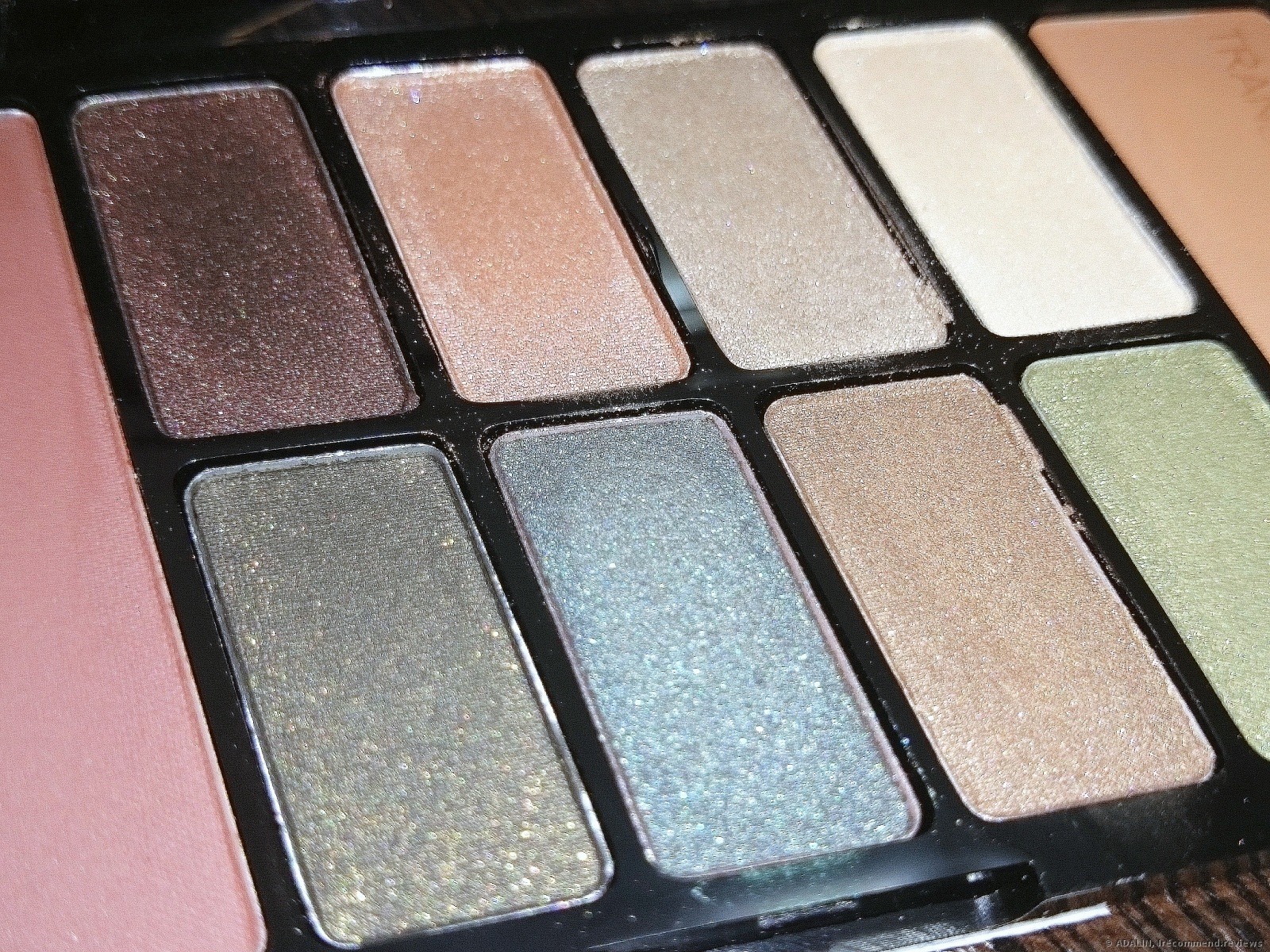
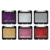
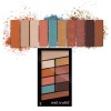
10 shades in total.
I doubt that the shade on the corner on the right would ever look good over anybody, as it’s too red, in my opinion. I tried to wear it as a blusher, but it’s still too red-toned, even rusty-red for my cheeks.
As for the one in the left corner, well, it’s beautiful and so dark plum. But my eyes look too sad or even tired with it on. I guess it’ll be more flattering for people of different appearance and eye color. The rest of the shades are more or less versatile.
Let’s have a closer look.
By the daytime light, they look like this…
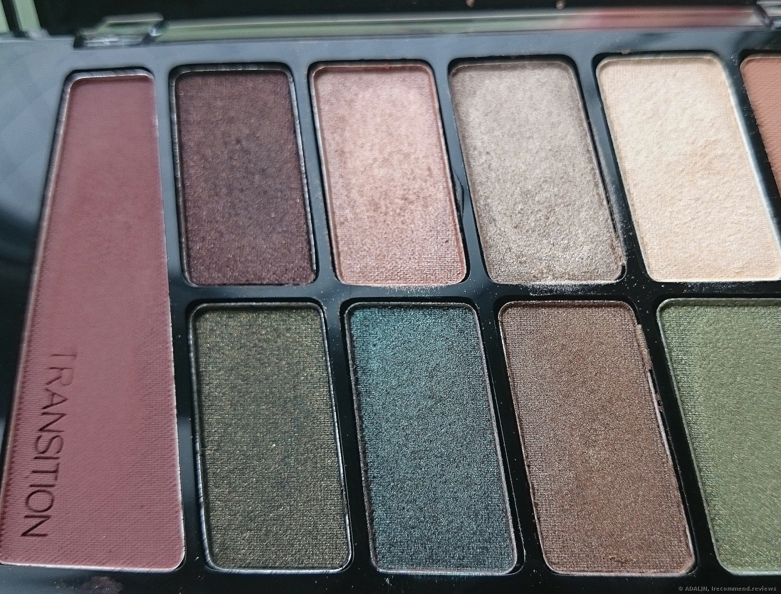
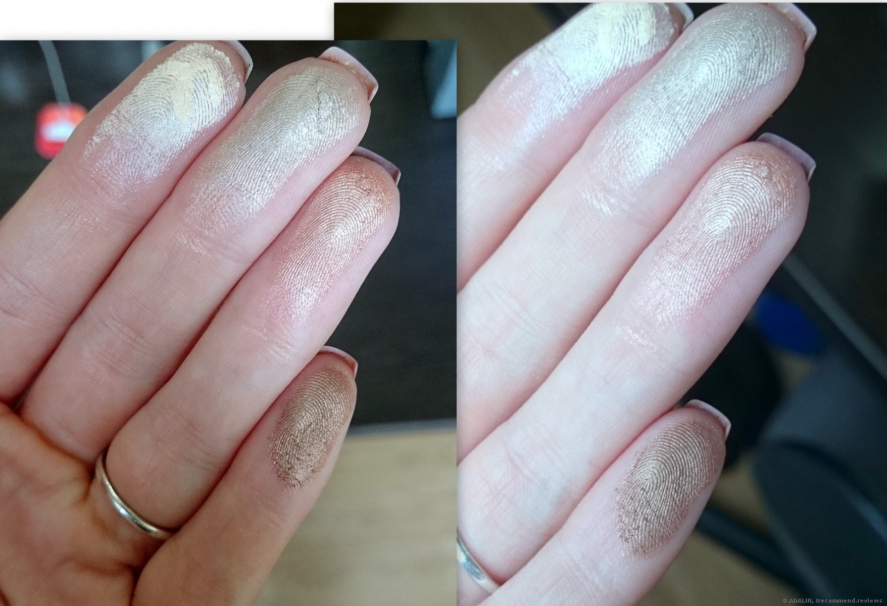
and a flashlight reveals them in a different way!
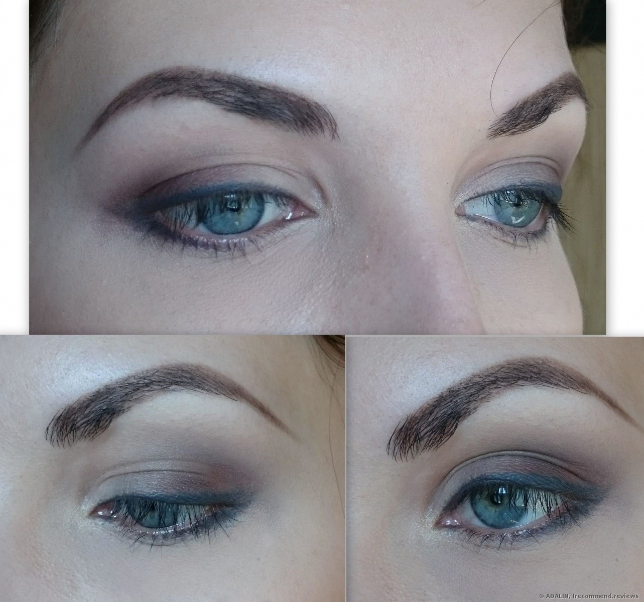
All the shades are shimmering, with the exceptions for those two in the corners. But they still look expensive on the eyes.
The shades aren’t what we are used to seeing. When you look at the palette, you can see just regular color selection there. But once you start applying them for swatches, they immediately bloom out of nowhere. I decided to divide them all into dark and fair shades for an easier look on. These ones will be perfect for inner corners highlighting and the one which is on my ring finger is an ideal highlighter shade, actually!
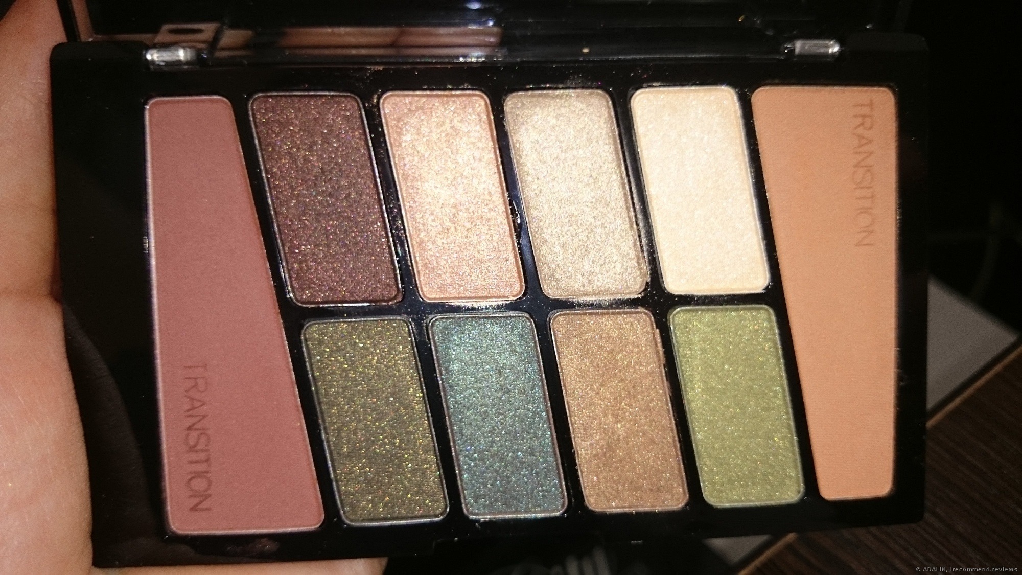
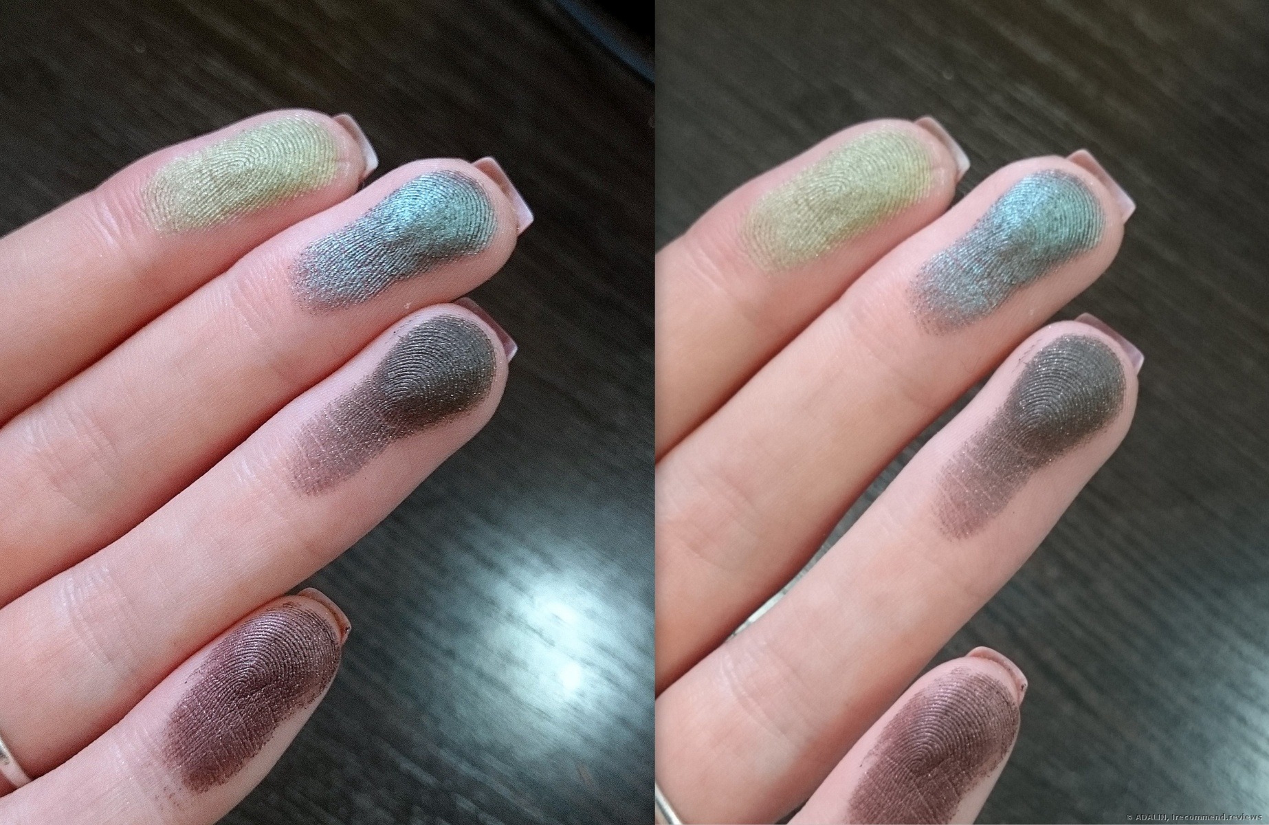
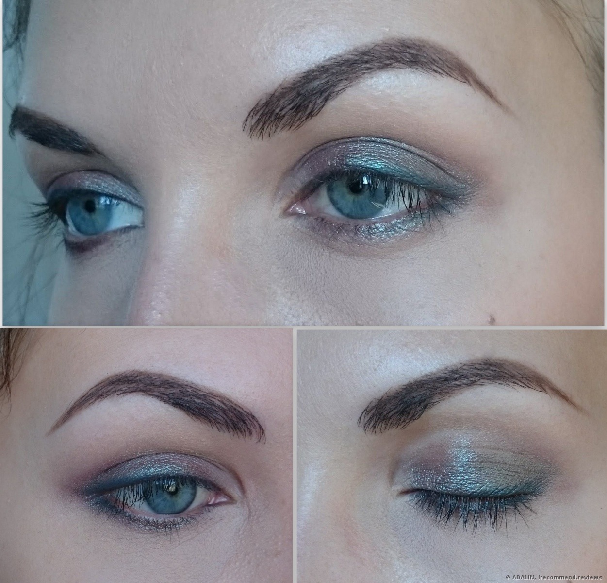
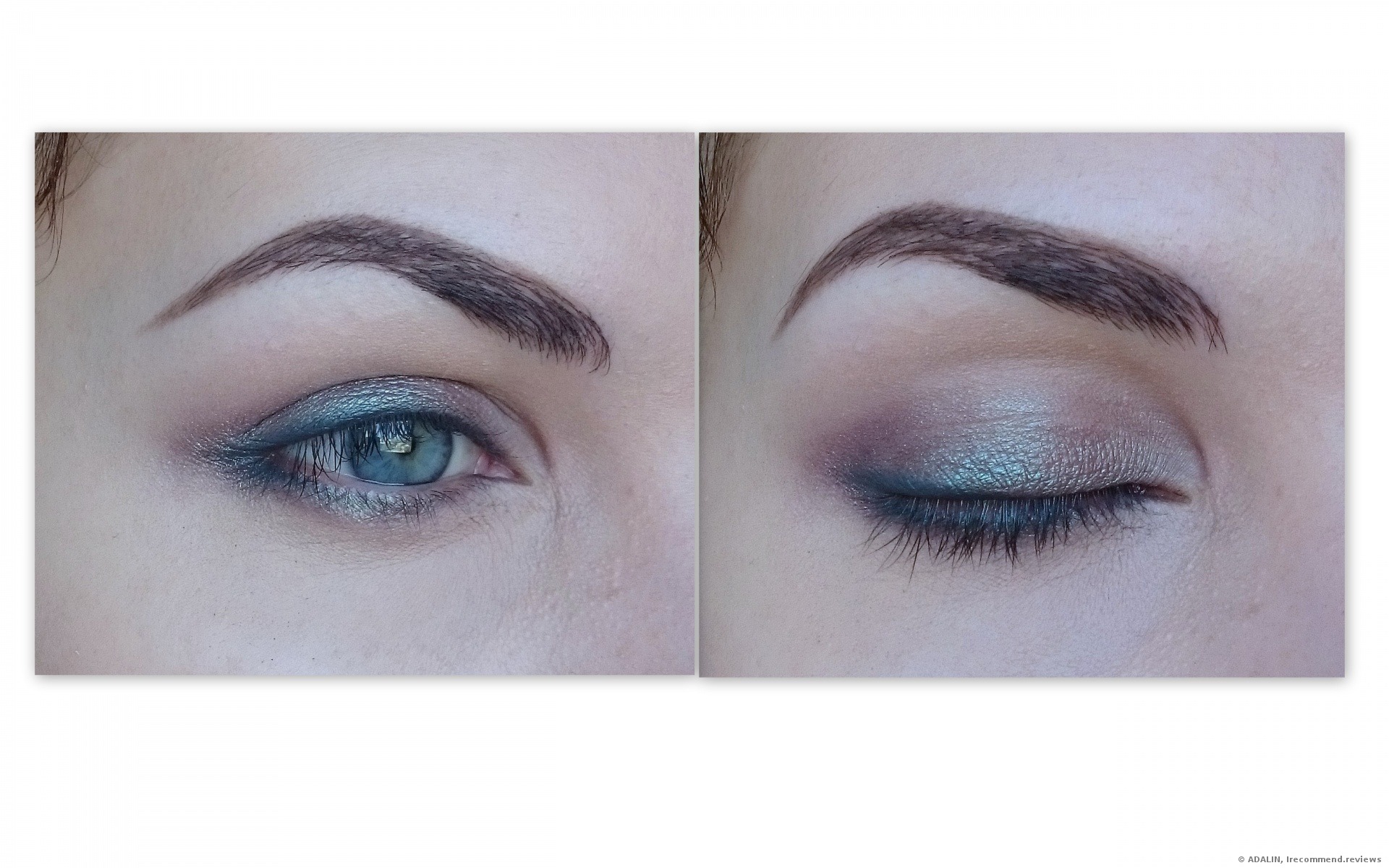
The dark shades are much more interesting than the fair ones. I fell for that turquoise most of all. It wins my heart over when I see how it appears over gray-blue eyes.
You can see how this shade shifts from baby-blue to light brown. It’s so great, I can create so many makeups with it, thanks to all that complexity!

blue douchrome shade
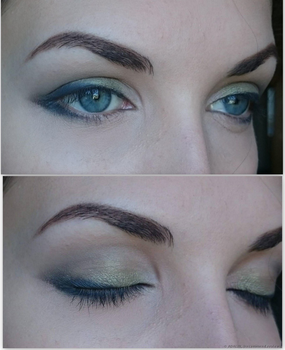
The light green one is in no way less interesting. I love pairing it with a gray eyeliner.
The dark green shade can work as an eyeliner. It’s easy to blend out, showing a magnificent wash of colors and never muddy stains.
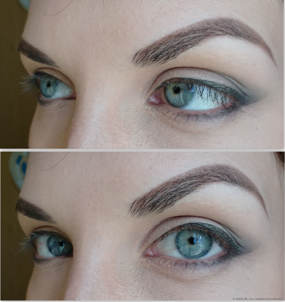
Dark brown one is such a beautiful, deep color, which shines more or less vibrant depending on the light.
The things that I liked:
1. The products are handy to apply with fingertips, sponges or brushes.
2. They easily blend out, creating a nice shift.
3. All the colors are matchy and can be mixed together.
4. They are easy to wash off with a regular micellar water or a face cleanser.
5. Their formula doesn’t dry out my eyelid skin. They never crease.
6. The colors remain vibrant and bold during the entire working day.
7. The pigmentation is just on fleek.
The things that I didn’t like
1. The palette doesn’t have a mirror.
2. No black shade included.
I don’t think that disadvantages are fatal here, especially when there’s almost no one who uses only one eyeshadow palette. And I’m sure that any other palette has a black color included.
I won’t take off any stars.
Thanks for your attention!