Recently, I decided to cut down on my eyeshadow palettes and buy only those palettes, which I don’t have in my stash. I mean, if I’ve already had three nude palettes, it’s very unlikely that I’d purchase more nude colors. I’m trying to be as rational as possible.
I didn’t have any pink palettes before, that’s why the Ooh La La has become a true discovery for me.
I bought it from the official website for $12:
Description:
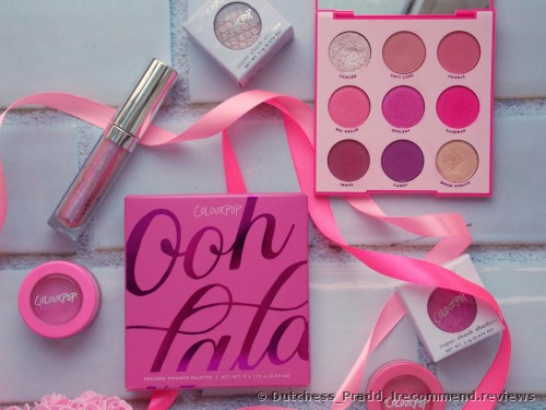
The palette was packed with a thin and bright cardboard cover.
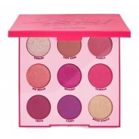
The palette itself is plastic with a click closure and a mirror.
All the shades have their own names.
Swatches:
The palette offers one topper shade, three glistening satins and five matte shades.
The swatches in rows with a brush and my fingertips. I applied them with one go with my fingers and with two or three swipes with a brush.
The first row:
The topper is rather boring unless it’s applied over a sticky base or a glitter primer. Then you can see two similar shades… And yeah, they look similar in the swatch and in life agreeably. It’s so difficult to create a beautiful transition between them. I wish one of these was darker and more pigmented for a wider color combination.
The second row:
Beautiful pink with peach undertones, which falls out during application, alas. Then it’s followed by the fantastic bold pink with blue undertone and matte Barbie color. The last two ones are madly tinting. If you don’t set the primer with some basic eyeshadow color, these two guys will tint your skin like there’s no tomorrow. If you don’t wear any primer at all, toss these two shades.
The third row:
Matte plum, matte purple, and a golden champagne shade. These aren’t bad. However, the first two can look similar after blending. Also, the champagne shade reveals all its beauty only over the sticky base or a glitter primer.
In addition:
There are three shades from the palette which require special swatching. These are diagonal of the palette from right to left: Tickled, Opulent, Moon Struck.
They appear like this over an adhesive primer:
The first one is a beautiful shifting blue and peach glitter. It’s especially magical when shooting with a flash. The second reveals a bright, almost metallic blue sheen, while the third shows a nice champagne-peach casting. All the products look brighter and bolder over the glitter primer, rather than over an adhesive base.
As for the Big Sugar, its beauty is already visible on the first swatch. It’s much easier to make to show its shift in life. But again, if it’s required, you can always wear it over the glitter base as well.
The result of palette dusting and the way it looks after swatching:
It’s bearable in my book, especially taking into account the fact that I can do my daytime makeup with it without any fallout and dusting. But when it comes to the Insta makeups, like a cut crease or anything, well, say hello to dusting.
In use:
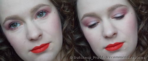
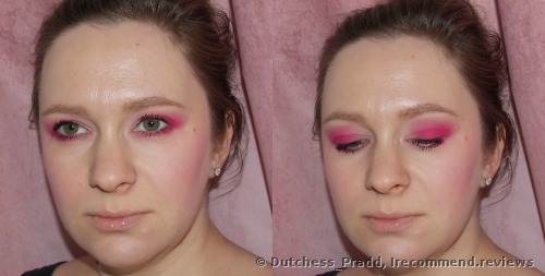
Placing the order, I was sure that I would be able to do a lot of wearable and daytime makeups with this palette, but in reality…
In reality, I tried hard and still can’t figure out how to work with it. Please, don’t pay much attention to my lipstick, I know that it doesn’t fit in here.
Should I mention the poor color selection for the daytime makeup? If I add some brighter shade, my daytime makeup won’t look so daytime anymore, yet still wearable.
I also added some Tickled shade over my lids here to show you its beauty over the glitter primer.
Maybe this is all due to my complexion, which is pale and never tanned. I guess more gentle peachy and washy colors would look more advantageous over me.
Let’s move on:
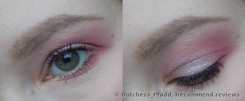
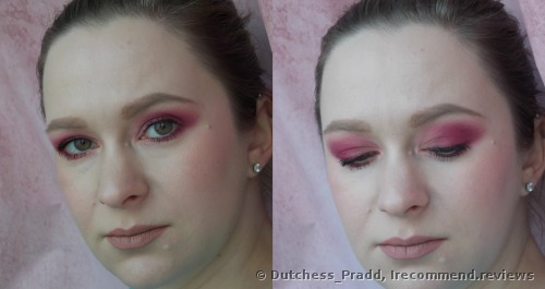
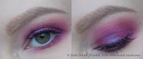
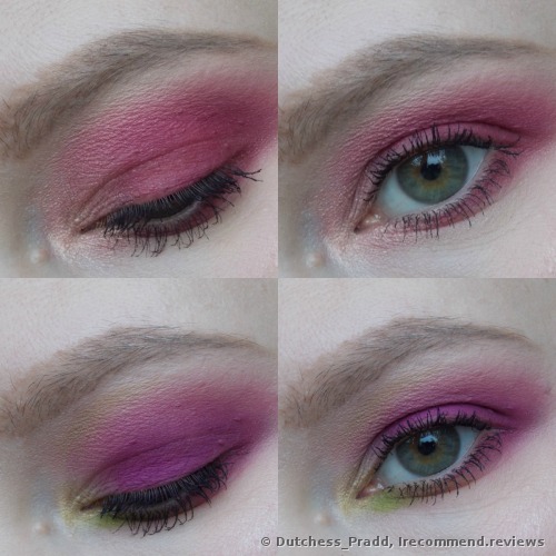
Some kind of smokey eyes. Pink version:
It looks redder when I add peachy shades to it. О_о
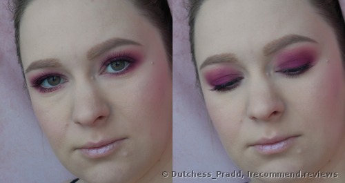
And more purple-plum version:
Well, some of you might think that these two are similar, especially from the distance. Well, maybe, yet still not as much.
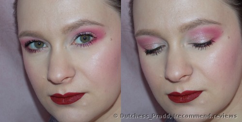
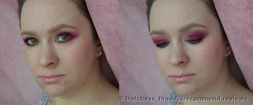
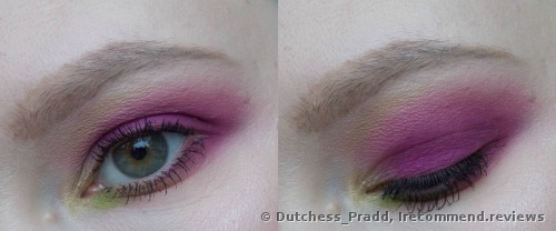
I like the purple version more. Here I cheated a little and added a little bit of the pale green color as well:
Here I also used the Jelly eyeshadows from the same brand:
Let us not forget about the tinting eyeshadows, which I used here and couldn’t wash off afterward:
At first I tried to wash them off with a cleansing balm, then with micellar water and after that, I cleansed my skin again. The stain wasn’t so obvious, though it was there.
In fact, the color combination isn’t wide here, even if you look from a close distance and very thoroughly.
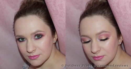
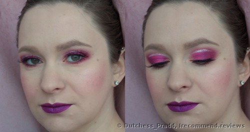
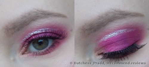
Here are some brighter makeups. I applied the Moon Struck glitter over a primer, the crease is done with the pink shade, the lower lash line and waterline are done with the purple color. I also layered the NYX pencil to seal the deal here:
In this makeup, I used almost all the shades from the palette, aside from the Tickled. The glittering line is from the Stila glitter:
In the end:
The palette is good, that’s true. I can list the lightweight formula, handy packaging, mirror inclusion, affordable price, nice blending and no allergic reaction to the advantages.
These are the main facts, I think. The staying power is excellent over the primer. I don’t recommend you wear these without a primer at all. The products don’t oxidize on my lids while wearing.
However, there are some disadvantages as well. I still believe that the color combination is poor. There are too many similar shades (on the pan as well as after blending), some colors require a good adhesive primer, which isn’t such a frequent resident of many makeup bags. It feels like these are minor issues but in my opinion, they are all worth one star off.
Well, you might think that I’m being picky but I’ll tell you that there have been a lot of eyeshadow palettes in my life and many of them don’t have such issues and I reach them most of all.
As for this palette, it’s my own Pinkie Pie as it is. It’s additional and more accenting, photoshoot- and party-friendly. I can’t fit it into my everyday makeup routine.
I’m pleased with my purchase and will carry on using it.  If you want to replenish your collection with some pink colors, then I think that it’ll be a good option among the affordable ones.


 If you want to replenish your collection with some pink colors, then I think that it’ll be a good option among the affordable ones.