For a long time I was lusting after some products on the Zoevacosmetics website, but the delivery tax used to stop me from immediate purchase. I mean there still wasn’t a product to impress me so much that I’d fall for it forever and pay for the product and delivery without any further ado. Until one day when I came to the conclusion that I desperately lacked good quality eyeshadow brushes in my stash and those two which I had were not at all enough for me anymore. I decided to purchase an eye set, but since that eye set alone looked too pathetic in my cart, I also decided to add an eyeshadow palette to enliven my order.
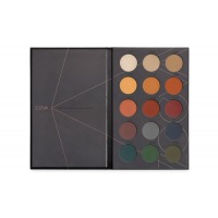
The next was the most interesting. The thing is that I’m not a matte eyeshadow fan, you know, that’s why I didn’t even have them in my collection before. I always used to use neutral shades for blending and as base colors, that’s why my makeup always would look muted, even though I could have vibrant shades as accents on my eyes. All in all, I really needed matte shades for blending, which would also work well as a foundation for my different eye looks. This is how I came to the conclusion that the Matte Spectrum palette would be alright for me, even though I couldn’t even imagine using such shades.
Here’s my Viseart digestion:
Looking for the swatches of this palette online, I also faced a lot of reviews where they were comparing this palette with the Dark Mattes palette from Viseart. Of course the shades don’t look like swaps, yet still they have a lot in common. I mean it! To some extent the Zoeva palette seems to be even better for me, though I deem that the top notch quality of Viseart is tough to bite. (People who have the Viseart palette, what do you think of it? Are they really similar :3? I saw a video review from a blogger who stated that Zoeva shades look “impressive” but she actually applied all the shades over a heavy primer.)
My order arrived covered with a branded box. I was really happy to see that nothing was damaged while shipping.
By the way, I had to sign so many papers to get them, that it felt as though I bought a Maybach car or a husband and not at all an eyeshadow palette with brushes.
Let’s take my precious out. The palette is pretty thin and lightweight. However, the material it’s made of is easy to stain, besides they don’t provide mirror inside, which I wish was there, because just imagine a mirror of that size on the palette top. 
Yet, I deem that the palette would be heavier if they included a mirror there. Other than that, I can’t say anything negative here.
I appreciate the simple and stylish design, which is minimal and frills-free. No hints of the cutest cute or top notch beauty here. The palette seems to be saying “love me the way I am” Okay, Zoeva, I do.
The back here traditionally has an ingredients list, weight, manufacturer and a batch code. I don't understand the use of a batch code and I didn’t find any info on the official site. Maybe it’s to check the expiration dates? I don’t know.
The palette itself looks the same as the cardboard cover, of course. So I can’t see any point in taking the cover’s picture as well.
The thing that I liked at once was that the manufacturer didn’t pretend to make the tiny bit of the product look as though there’s plenty of it, smearing the powder all over the refill pan. Here we can see 15 shades 1.5g each. This is a good bargain for the price, I think, taking into the account the formula of the product, which shows minimum fall out. Overall - the palette will go a very long way.
The shades don’t have any names, but they have numbers. I don’t take the manufacturers’ vivid competitions in naming their shades seriously, so the absence of names isn’t a big issue for me at all.
Inside the palette screams with different colors. This is what they look like in reality (in the pictures where I tried to show you close-ups, all the colors look traditionally lighter rather than in reality).
What I like about this shades is that they are bright, though not too vibrant. It makes them wearable all year round and not only in hot summers in Brazil, as it usually happens with many palettes that offer bright eyeshadows.
What do I have to say about the eyeshadows? I like them. I can put it this way - the palette is “Ordnung” as Germans say, which means “Alright”. The products are saturated with pigment, they don’t fall out and stay on long showing a good color payoff on my eyes. They apply on my eyes much better, even if I don’t wear a primer, rather than on my hand. (which is logical, isn’t it? After all, my hand skin is much drier, while the eyelids are usually naturally dewy). There’s a little nuance pigmentation- and sheerness-wise of each and every color, but in general the blending and packing of the pigments is okay. They never blend into a mess on my eyes.
The first row~
- A very well packed with the pigment white color. It isn’t chunky texture-wise, that’s why I sometimes use it as a transition shade from the bright to neutrals. I also love using it as a white eyeliner.
- This one is a little bit more chunky than the previous shade and it also seems to be a little bit more neutral. I use it as the foundation color.
- Almost all my eye makeup looks are sure to have a sandy yellow color in the crease or as a transition shade. This one is good as a safety color for me.
The second row~
- This one looks a tad chalky in the pan and as though whitening, but it applies smoothly over my lids with a thin yellow color that doesn’t have any white cast. Sometimes I can wear it even on my mobile lid, even though at first I was afraid that it’d look like “hello hepatitis” on my eyes. But no, it’s a good color.
- this shade is the same as the first one, though it’s got more pigment to it.
- this color is a little bit chunkier than the first two shades and it’s also great quality-wise.
The third row~
- amazing peach shade, for those who aren’t mentally ready for the red pigments on their eyes. It is dry, but the color payoff is fantastic here.
- It’s a saturated red color, which has warm-toned undertones. I like packing it on my lids, because the color looks amazeballs then. Attention all the vampire lovers, you’ll fall for it! It was tricky to layer this shade on my hand, though in general the color is killer.
- Luxury berry shade. I always lust after it when I want to darken the crease. This shade is the driest from the palette, but its pigmentation is so good that I forgive it, especially when I wear it over a primer.
The fourth row~
- I’ve never had such a mauve color before. It’s very beautiful and the texture is just something! It doesn’t pack to the intense dusty-lilac color, though.
- Dusty-blush hue. This one is a good shade to stain your eyes, unless you work well with it. It requires a base for sure, otherwise the color would look patchy. If I don’t layer it, I can see only a grey based shade and that’s all. I’m biased here, because I’m not into such shades at all. >_>
- A gorgeous navy shade. This is one of those blue colors that is to die for. Even though I can’t imagine myself wearing such a color on my eyes. Dry texture, which shows a massive color payoff indeed.
The fifth row~
- Intense turquoise shade. This color is also dry texture-wise, but still the pigmentation is stunning. This row is above all the others pigmentation-wise. One swipe already renders the same looking pigment as on the pans.
- Dusty turquoise. I hardly ever use this shade, even though it is juicy, because the quality is top notch and the color is amazing.
- I love this khaki color and use it a lot. The pigmentation, again, is fantastic and there are no issues with packing this color as well.
Swatches~
All the swatches were applied WITHOUT a primer. For clarity I applied the colors with my finger and a brush. With the primer the shades look something 3 times brighter, I should say.
Swatches of the first and second rows with my finger…
And with a brush
As you can see, these rows aren’t troublesome at all, even though my hand is dry and in general there isn’t much that can stick to it!
Swatches of the third and fourth rows with my finger…
and with a brush
Here you can see how badly the blue and red colors apply on my skin. Such problems don’t appear on my eyes. Again, here I applied the products with 2 layers, but I also have a chance to layer them.
Swatches of the fifth row with my finger...
And with a brush
It’s obvious that this row is absolutely fuss-free, no matter where I apply the shades and what tools I use.
Makeups ~
I don’t like totally matte makeups, so I always add some shimmer too. Besides, when I have the entire palette of matte shades in my disposal, it’ll be a crime not to adorn a shimmer accent with them. Here, aside from the hero of the review I also used:
- my trusty Nabla Dreamy palette
- affordable beauty Makeup Revolution Flawless
- Glistening ColourPop Golden state of mind
My makeup over the E.L.F. primer
So, it’s time to draw conclusions.
The price/quality rate is perfect for me here. All the shades are a masterpiece all terms-wise. The texture is actually the reason why some shades are only 90% pigmented. But this issue is easy to correct with the described above eyeshadow primers.
“Yes” to you if you: 🍀
- are into makeup looks which don’t look like from a Rio carnival
- want to get a color selection of matte shades for an affordable sum of money
- have been longing to give a shot to the brand, but didn’t know what to start with, because it seems that you’ve already owned everything. 
“No” to you if you: 🍁
- can’t stand bright eye makeups
- are more into purple/pink colors. The palette doesn’t have them at all.
For me this palette gets 8.5 out of 10 neatly brushed-up German babies!


